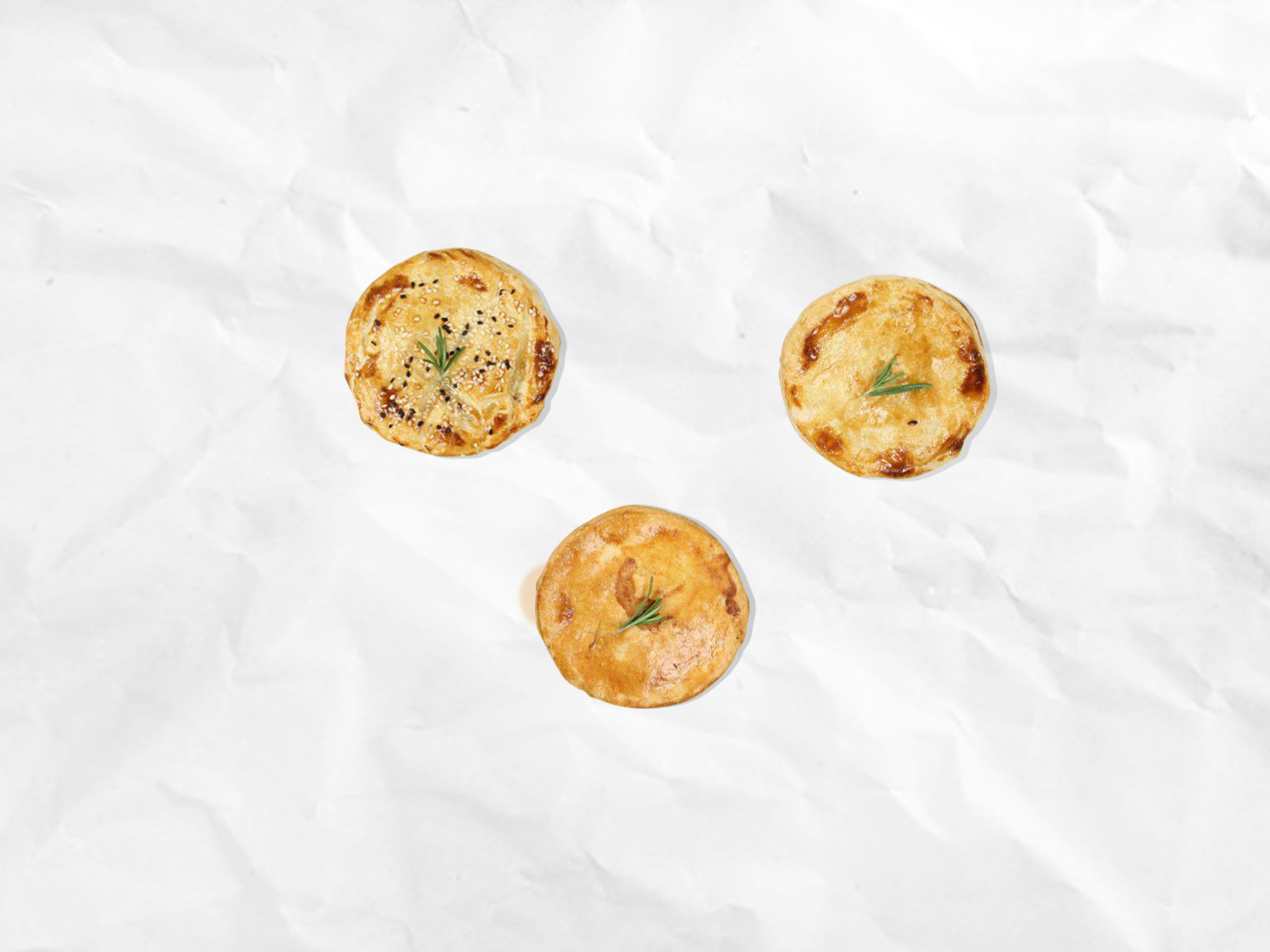
Who: Fast food restaurant of homemade pies ‘My Pie’
[Original version ‘Мій Пай’]
[Original version ‘Мій Пай’]
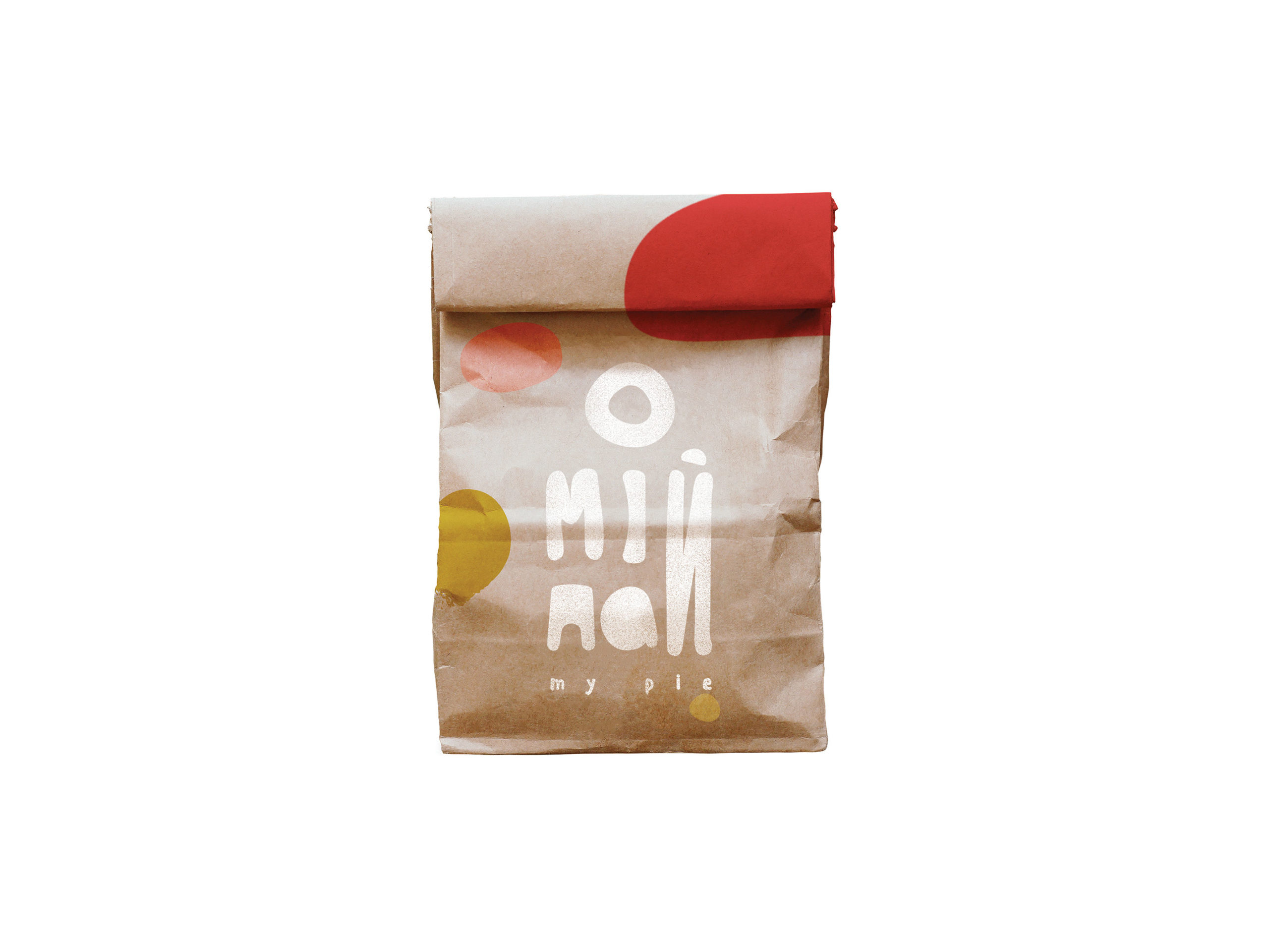
What: Identity and package design
Concept: There were two key points in creating the identity of My Pie: fast and fat.
The opening of the first café was planned in Kyiv Boryspil Airport. It is the biggest and most dynamic airport in the city with over 1 294 451 passengers served monthly.
People are in a hurry to catch their plane, waiting near the gate, slowly getting information about the flight from the monitor, keeping an eye on their watches with the next flight in mind, and experiencing stress in one way or another.
People are in a hurry to catch their plane, waiting near the gate, slowly getting information about the flight from the monitor, keeping an eye on their watches with the next flight in mind, and experiencing stress in one way or another.
I was wondering what could distinguish this brand from others in the fast food industry.
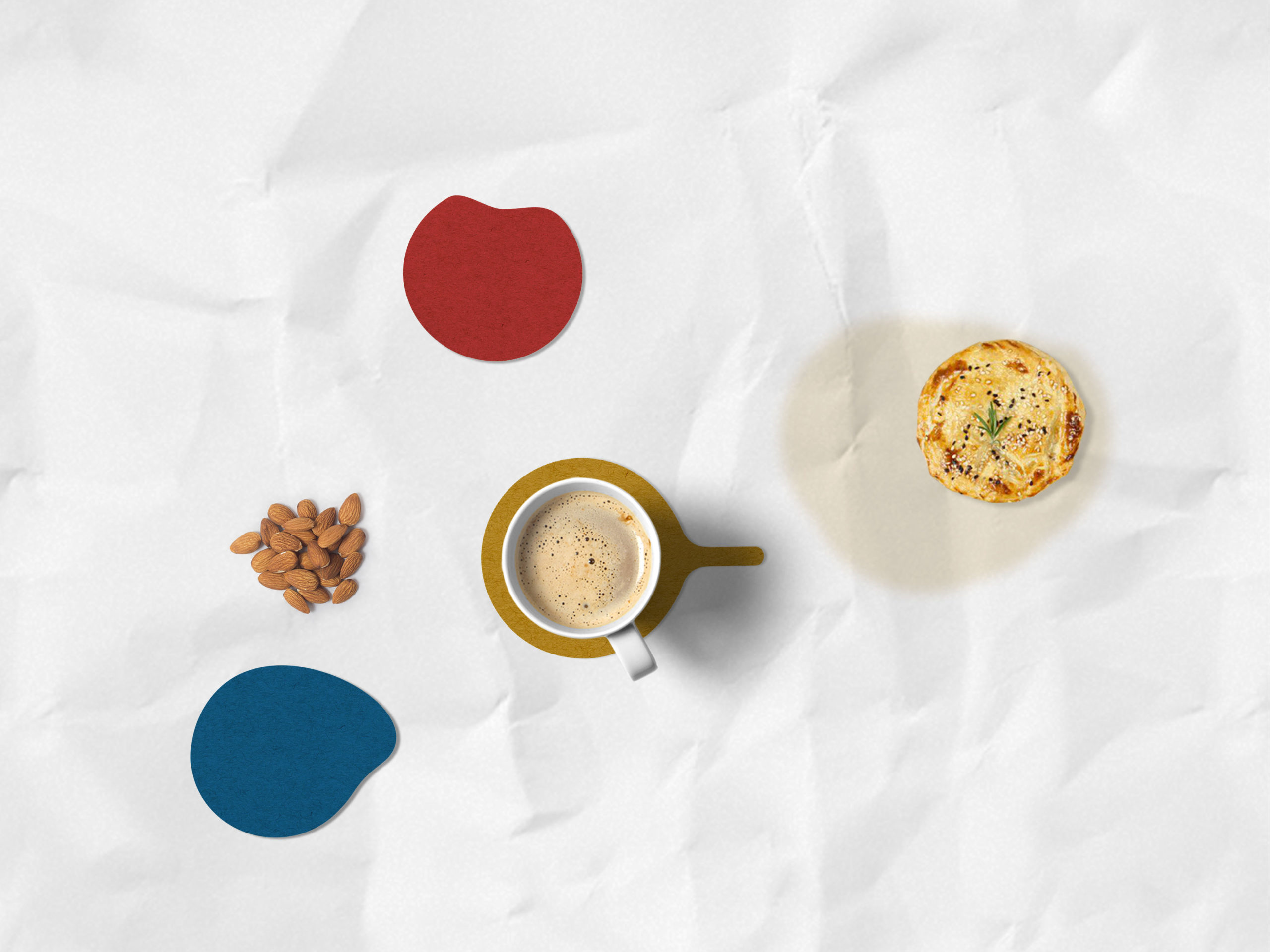
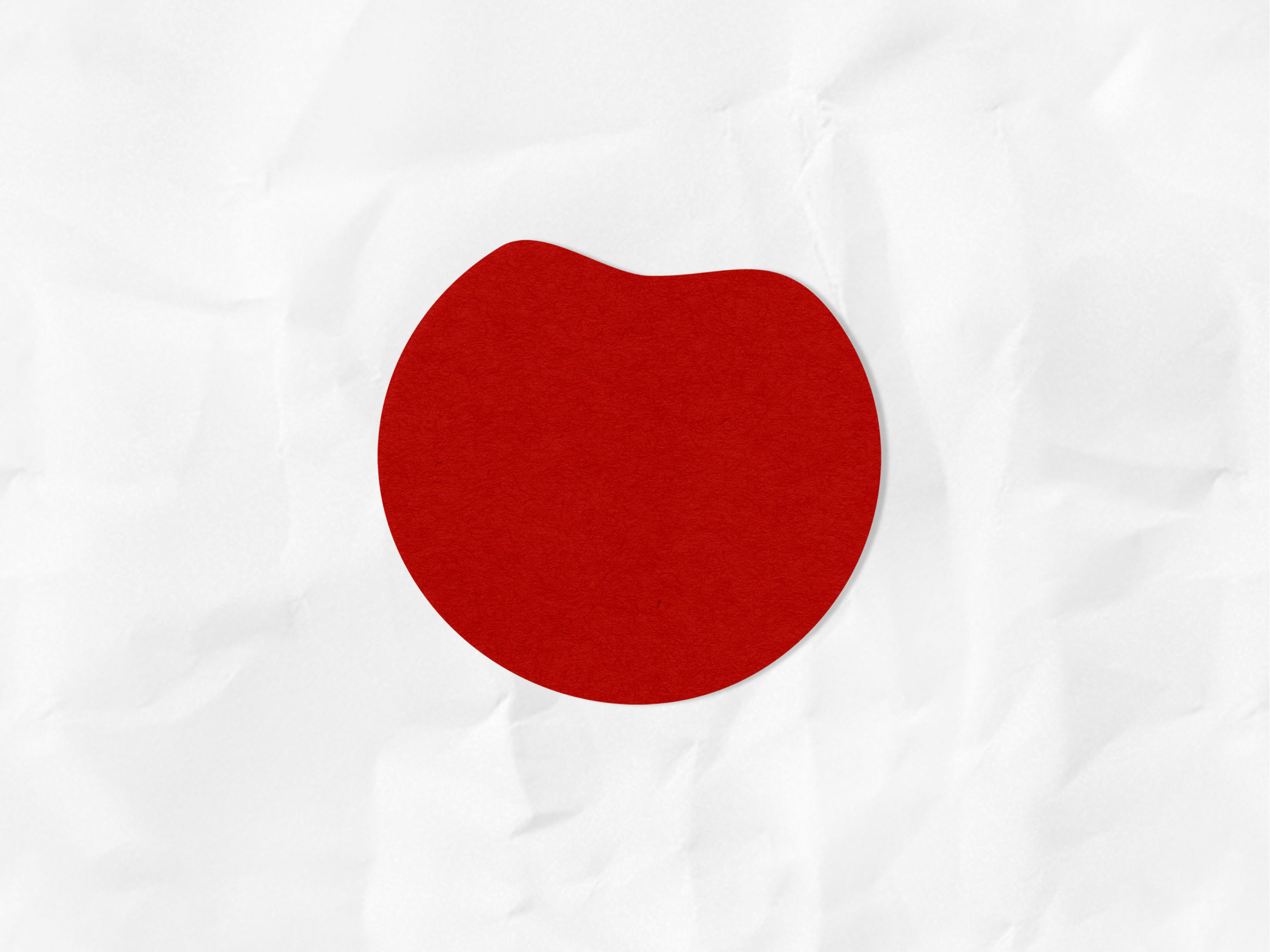
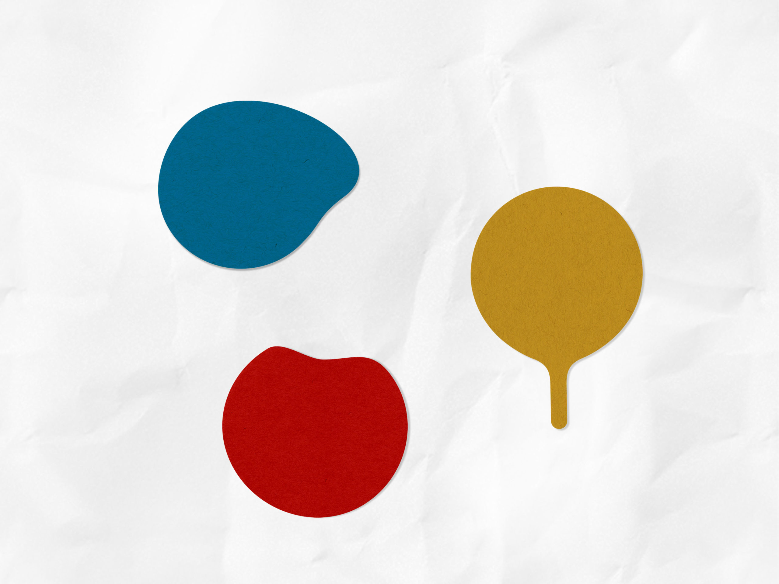
I decided to start with the location: the airport as a place, with a lot of feeling of anticipation but also with a lot of tension. The intensity and pression of the airport tempo, on one hand, and the atmosphere of rush on another, made me think about food being a relief medicine, a way to relax and not only hunger preventer during the flight since the pie is pretty filling. I wanted to emphasize the hearty value of it. The visual codes, such as fingermarks and fat spots, are also part of fast food culture. Why not integrate them into the brand’s visual portrait. The liquid splashes become coasters for drinks and dirty fat spots together with the fingermarks become the graphics for the packaging. Along with this comes a kind of joke on the topic of visual inelegance or tastelessness in the fast food culture.
I decided to start with the location: the airport as a place, with a lot of feeling of anticipation but also with a lot of tension. The intensity and pression of the airport tempo, on one hand, and the atmosphere of rush on another, made me think about food being a relief medicine, a way to relax and not only hunger preventer during the flight since the pie is pretty filling. I wanted to emphasize the hearty value of it. The visual codes, such as fingermarks and fat spots, are also part of fast food culture. Why not integrate them into the brand’s visual portrait. The liquid splashes become coasters for drinks and dirty fat spots together with the fingermarks become the graphics for the packaging. Along with this comes a kind of joke on the topic of visual inelegance or tastelessness in the fast food culture.
Awarded as best identity design project @Ukrainian Design: The Very Best Of 2018, Kyiv, 2018
